Place Prize Infographic: From Pencil to Print
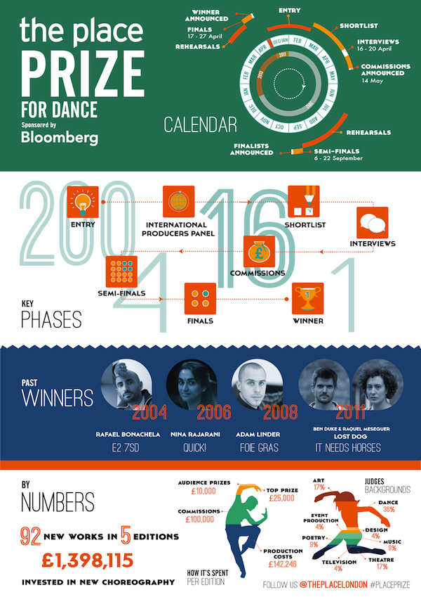
Earlier this month, we delivered a new infographic to our client The Place, London’s contemporary dance house. The project was to feature The Place Prize, a competition that gives choreographers a chance to create new work, develop their skills and bag up to £35,000 in prize money.
We love infographics. They are useful visual messages and they are super fun to work on as they require a broad set of skills. Our brief was to help those attending a Place Prize performance visualise the structure of the competition and to highlight key data without having to rely on long descriptions online or elsewhere.
At brainstorming phase we came up with a clear idea of the stories we wanted to develop, namely:
- Structure of the competition: Calendar and Phases
- Past Winners
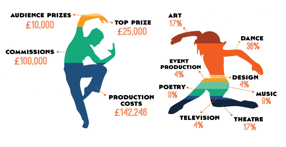
- Prize Distribution and Judges
After discussing the initial sketches with the client, it was time to move onto Illustrator.
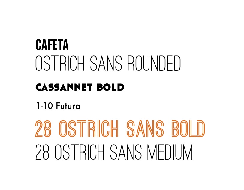
For our typefaces, we used Ostrich Sans Rounded for the section titles combined with Cafeta for sub-headings; Cassannet Bold for the labels, Futura for calendar dates and a combination of Ostrich Sans Medium and Bold for the numbers.
As versions progressed, we concluded that a “dance element” was missing and we decided that the bottom charts would be the ideal spot for that. We created silhouettes from photos of contemporary dancers and split them using colourful stripes and width proportional to each percentage.
Finally, we tightened the copy and adjusted the colours to bring everything together. The final result is shown below:
Our clients printed the infographic as a poster which will be on display at The Place (foyer and bar) for the duration of the competition. The digital version has been made available from the Place website for audiences to download.


